The Google Store
2014
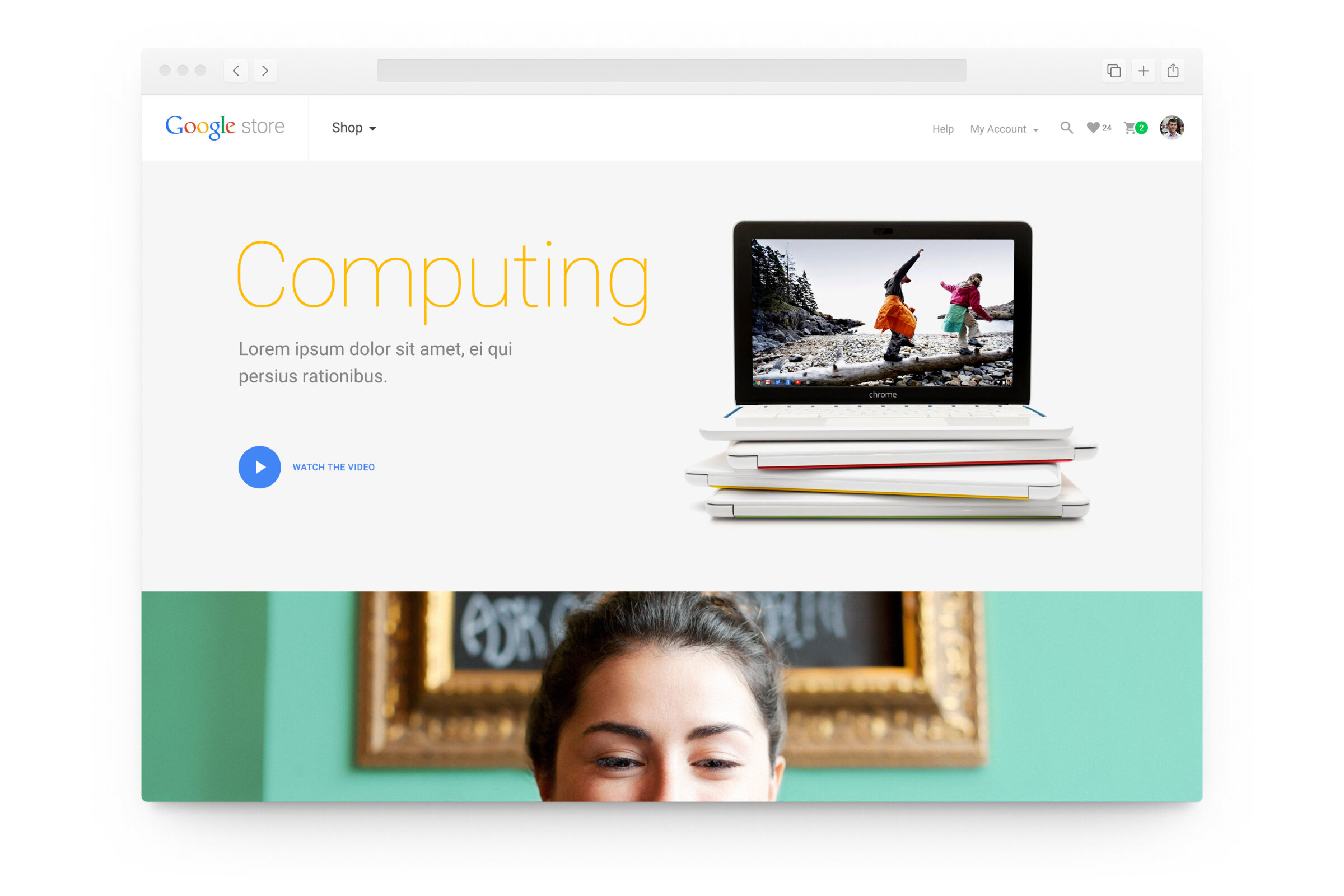
2014 was a pivotal year for Google, with a number of high-profile product launches and an entirely new design language, Material Design. In the spring, Odopod began collaborating with Google on a new e-commerce platform to be the home for hardware offerings distinct and separate from the Google Play Store for digital media. During those early stages, we worked closely with Google as they prepared to launch Material Design, and we were one of the first Material Design web products from Google.
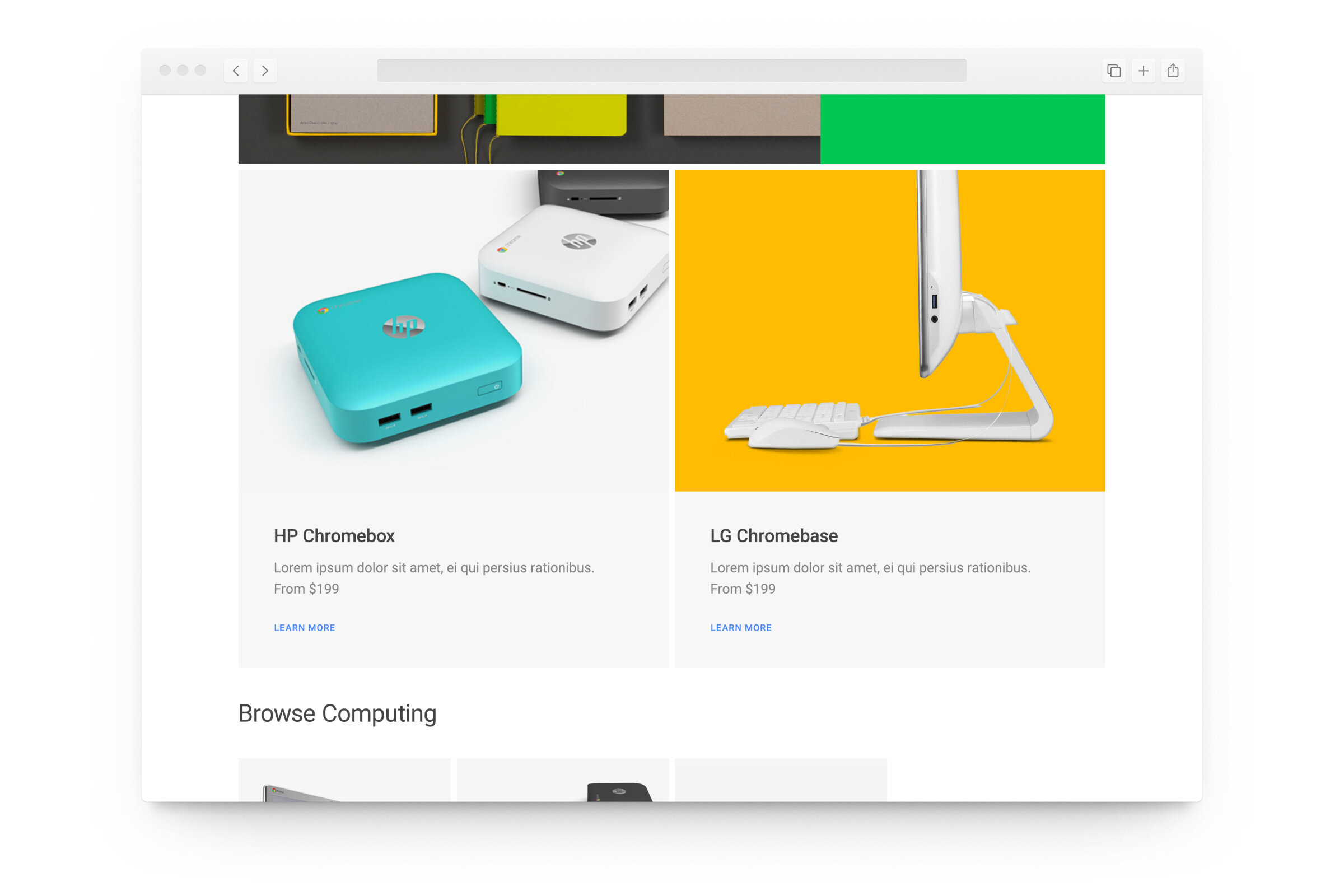
The Google Store serves a number of hardware-specific needs, from customization options with multiple SKU's per product line, to education and marketing, to accessories and other add-ons. We designed the site to be fully-responsive and mobile-first, which proved to be a unique challenge as many of the content creators for the Store did not have previous experience with responsive design considerations.
As part of our delivery, we prepared a number of tools to ensure that content creators could visualize their assets in-context, in particular with responsive imagery that adapted to different aspect ratios across breakpoints. I built the framework for these templates and oversaw the Content Creation Manual we delivered at the conclusion of the project.
Timeline
4 months
Team
Art Director
Senior Visual Designer
Visual Designer
Front-End Web Engineers (2)
Role
Visual Designer,
Odopod
Our content creation manual included Photoshop templates that content creators could use to prepare assets and layouts. Having the ability to directly preview imagery in Photoshop proved extremely useful to Google's content team, many of whom were new to responsive design.


